In the SaaS world, your landing page is not just a webpage — it’s your primary sales engine.
Unlike traditional websites, a SaaS landing page has one clear goal:
👉 Convert visitors into sign-ups, demo bookings, or paying customers.
At ScalerGridTech, we design SaaS landing pages that don’t just look modern — they drive measurable growth. Here’s how.
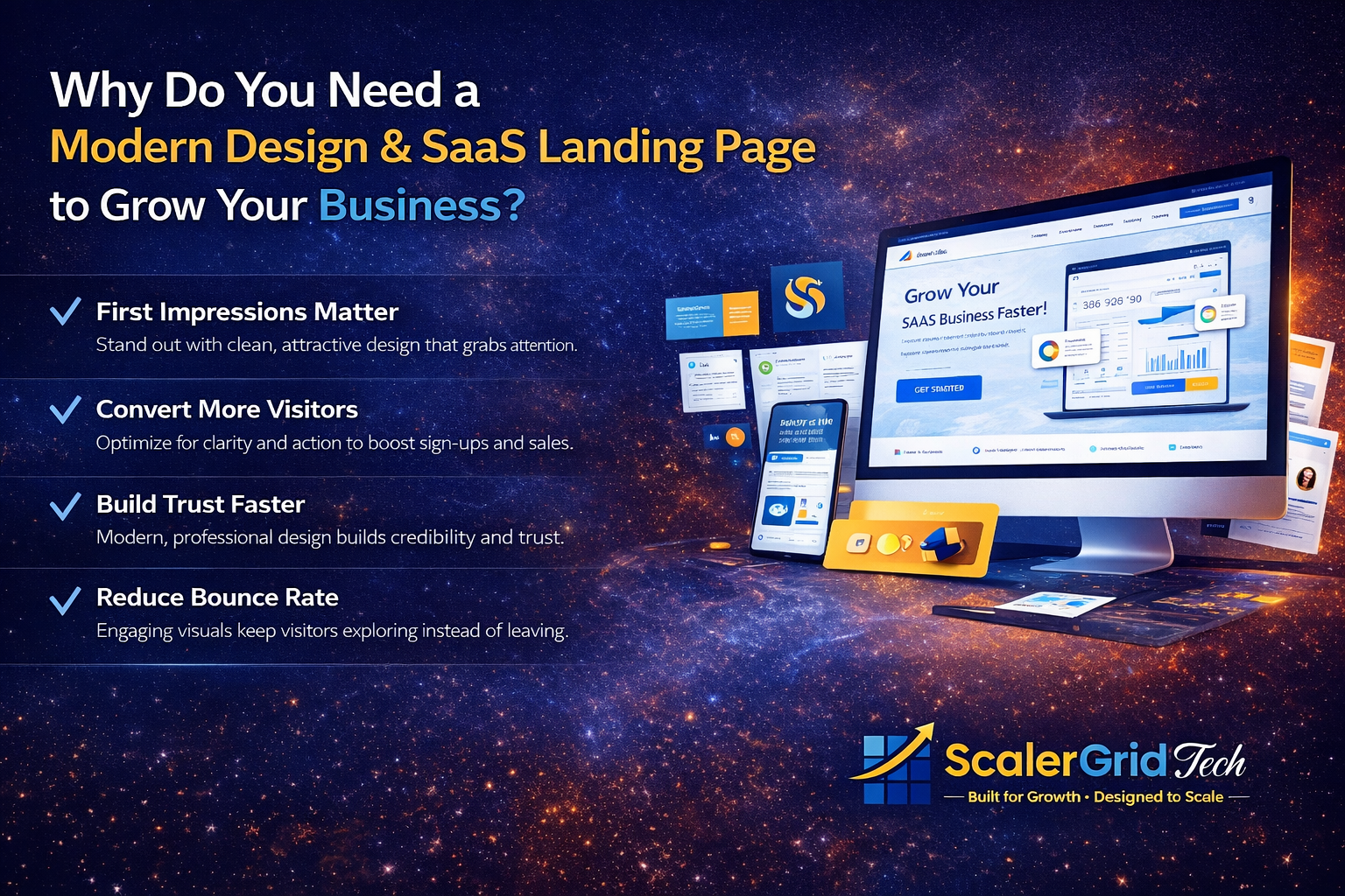
Why SaaS Landing Page Design Matters
You can run ads.
You can drive traffic.
You can invest in SEO.
But if your landing page lacks clarity and structure, conversions will suffer.
A well-designed SaaS landing page helps you:
- Build instant credibility
- Communicate value in seconds
- Reduce bounce rate
- Increase free trial sign-ups
- Shorten the sales cycle
In short, design directly impacts revenue.
1. Clear Value Proposition (Above the Fold)
When someone lands on your page, you have about 5 seconds to capture attention.
Your hero section must clearly answer:
- What do you do?
- Who is it for?
- Why should I care?
Avoid vague messaging like:
“Next-gen AI-powered solutions.”
Instead, be specific:
“Automate your reporting and reduce manual work by 60%.”
Clarity converts. Confusion kills conversions.
2. Outcome-Driven Messaging
SaaS companies often make one big mistake — listing features instead of outcomes.
Users don’t buy features.
They buy results.
Instead of:
✔ Advanced analytics dashboard
Say:
✔ Make faster decisions with real-time insights
Translate features into tangible business benefits.
3. Strong Visual Hierarchy
Design isn’t decoration — it’s direction.
A high-converting SaaS landing page uses:
- Clean layout
- Proper spacing
- Clear typography
- Focused call-to-action
- Product screenshots or demo previews
Your design should guide the user’s eye naturally from headline → benefits → proof → CTA.
4. One Clear Primary CTA
Too many buttons create confusion.
Every SaaS landing page should have one main action:
- Start Free Trial
- Book a Demo
- Get Started
Secondary actions can exist — but visually, your primary CTA must dominate.
Simplicity increases conversions.
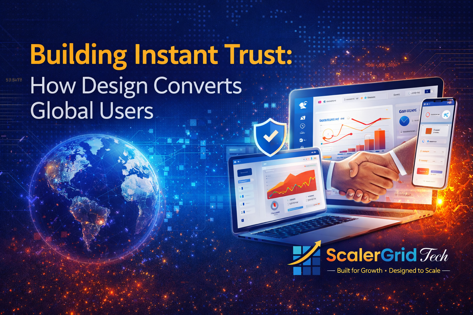
5. Social Proof That Feels Real
Trust is everything in SaaS.
Add:
- Client logos
- Case studies
- Testimonials with results
- User metrics (e.g., “Trusted by 5,000+ teams”)
When visitors see others succeeding with your product, hesitation decreases.
6. Mobile Optimization is Non-Negotiable
More than half of SaaS traffic comes from mobile devices.
If your landing page:
- Loads slowly
- Looks cluttered
- Has tiny CTAs
You’re losing conversions instantly.
Responsive, fast-loading design is essential.
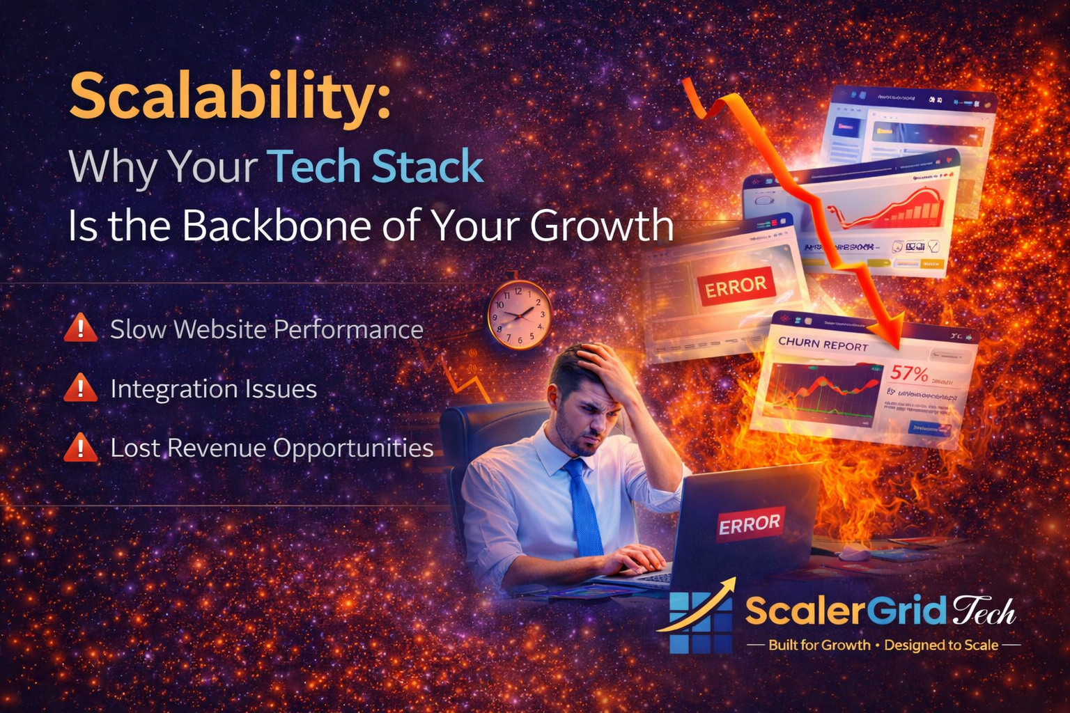
7. Speed & Performance
Even a 1-second delay can reduce conversions.
Optimize:
- Images
- Scripts
- Hosting performance
A fast SaaS landing page builds trust and improves user experience.
8. Data-Driven Optimization
Design is not “set and forget.”
The best SaaS landing pages are continuously optimized through:
- A/B testing
- Heatmaps
- User behavior tracking
- Conversion rate analysis
Small tweaks in headline, CTA color, or layout can significantly impact results.
Common SaaS Landing Page Mistakes
❌ Too much text
❌ No clear value proposition
❌ Multiple conflicting CTAs
❌ Weak product visuals
❌ No social proof
❌ Poor mobile experience
Avoid these, and you’re already ahead of most competitors.
How ScalerGridTech Helps SaaS Brands Scale
At ScalerGridTech, we design landing pages that are:
✔ Strategy-first
✔ Conversion-focused
✔ Modern and scalable
✔ Performance-optimized
We combine UX psychology, modern UI principles, and growth strategy to help SaaS businesses turn visitors into loyal customers.
Final Thoughts
Your SaaS landing page isn’t just a design project — it’s a growth asset.
If your page isn’t converting, it’s not a traffic problem.
It’s a clarity and strategy problem.
Ready to build a SaaS landing page that actually drives results?
Let’s design for growth. 🚀

 Home
Home
